In today’s world, we’re all flooded with information. So, getting noticed in a packed email inbox is a big challenge. Now, more than ever, a good newsletter isn’t just about the words you write. It’s also about how it looks. An effective newsletter image can grab your reader’s attention, pull them in, and get your message across in a cool and interesting way.
Discover in this guide how to make the best use of images in your newsletters and the ways you can add them. Plus, you’ll get lots of ideas, real examples, and even some handy tricks. The goal? To help you make your newsletter images the best they can be and keep your readers hooked.

If you’re still wondering, “Should my newsletters include images?”, “Why do images matter in newsletters?” or “Do emails with images perform better?”, first, let’s dive into these topics to eliminate any uncertainties!.
Some newsletters feature images, while others do not. The use of visuals depends on the content strategy and the target audience’s preferences. Incorporating images can boost engagement and add visual appeal, but some newsletters opt for a text-only approach to deliver their message concisely.
Newsletters have evolved from simple textual updates to rich, dynamic communication tools. Images in emails have increasingly become a key factor differentiating an engaging newsletter from a dull one.
An eye-catching email image can break up large chunks of text, provide context, and stimulate the reader’s interest. Newsletter images are not merely decorative elements, but strategic tools that increase engagement and boost performance.
Yes, emails with images often perform better than those without. Studies suggest that newsletters with images can boost engagement by up to 650% compared to text-only versions. For instance, Campaign Monitor found that newsletters with images had an open rate of 21.3%, significantly higher than the 10.5% rate for those without images. Similarly, Omnisend found that newsletters with images had a 3.2% click-through rate, outperforming those without images, which had a 1.9% rate.
However, the effectiveness of images varies based on industry, audience, and content. Utilizing relevant images that load fast, tell a story, and highlight crucial information can significantly enhance your newsletter’s performance.
Before we explore how to use images in your newsletters, let’s look at common mistakes to avoid.
💡 Here’s a useful table outlining what not to do when adding images to your emails, and how to fix these issues ⬇️
| Things to Avoid | Reasons & Solutions |
|---|---|
| Using irrelevant images | Images should support your message. Don’t confuse readers with unrelated pictures. |
| Overloading with images | Too many images can be distracting. Keep a balanced mix of text and images. |
| Using low-quality images | Blurry pictures look unprofessional. Always use optimized images. |
| Ignoring the file size | Large files slow down email loading. Keep images small in size but high in quality. |
| Forgetting about alternative text | Alt text helps when images can’t be seen or don’t load. Always include descriptive alt text. |
| Not testing your email | Always preview your emails on different devices and clients to make sure everything looks good. |
Then you need to read this 👉 How to set up an unsubscribe link (and why it’s mandatory!)
The first tip to effective image use is choosing visuals that align with your content and brand. Select pictures that complement your text, provide value, and evoke the desired emotions or responses in your readers. Here are some resources for image selection:
Effective images can come in various forms – from photographs and infographics to illustrations and icons. Consider the best image size for email and adapt your visuals accordingly. A larger email background image can provide a captivating backdrop for your content, while smaller images can illustrate specific points or break up sections.
Read this guide 👉 How to Use Substack to Create a Successful Newsletter: Tips and Tricks
Optimization of your newsletter images involves careful attention to layout and size. The email graphic size directly impacts how quickly your email loads and how it displays across different devices. The best image size for email is generally around 600-800 pixels in width, but the ideal size might vary depending on the email design and the devices most of your subscribers use.
The newsletter background should complement and not overshadow your content. A balance needs to be struck between the aesthetics of the mailer image and the readability of the text. If you choose to use an email background image, ensure it does not interfere with text readability.
Several tools can assist you with creating, editing, and optimizing images for your newsletter:
For image compression:
💡 Consider using these resources to make sure your newsletter images are interesting, clear, and well set up. This can make your newsletters even better, getting more people to interact and boosting their performance.
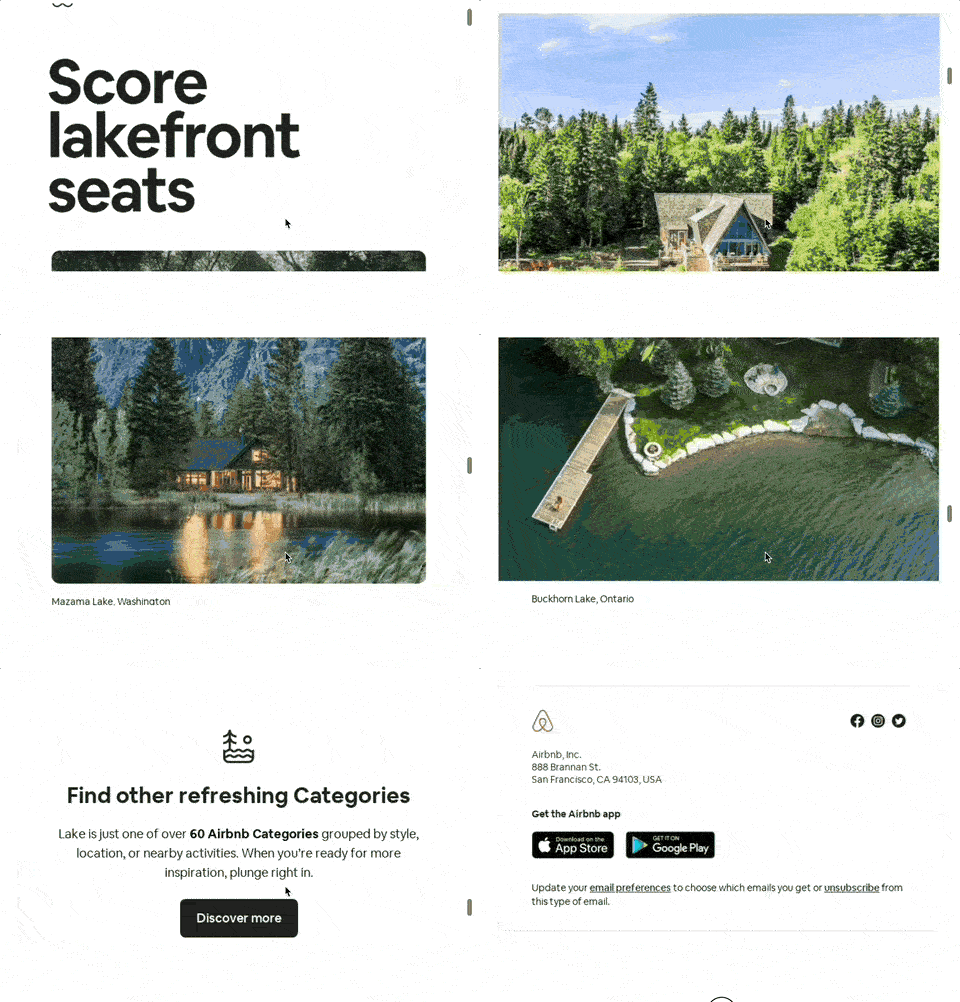
The following email from Airbnb, titled “Your lake vacay won’t book itself”, is an excellent example of the effective use of newsletter images. The visual elements are clearly incorporated to communicate the message and create a sense of desire for a lake vacation. Below, a breakdown of how Airbnb has used images:

✅ Header Image:
The newsletter opens with an attention-grabbing, full-width header image of a peaceful lake setting, overlaid with the enticing phrase “Your perfect lake day starts here…”. This image serves multiple purposes:
✅ Property Images:
Below the header image, there are images of various lake vacation rentals. Each image is accompanied by brief yet descriptive text about the property and its key features.
✅ Image Size and Quality:
The newsletter images are well-optimized both in terms of size and quality. The images are high-resolution, ensuring they look good on screens of various sizes. At the same time, the image file sizes seem to be optimized so that the email loads quickly, even on slower internet connections. This attention to email image size contributes to a smooth, enjoyable user experience.
✅ Layout and Design:
The overall layout of the email is clean and uncomplicated, allowing the images to shine. The images are the main focus, with each property’s photo taking up a significant portion of the layout, drawing the reader’s eye. This is another demonstration of effective newsletter image usage – images are not fighting with text for attention but are working together to convey a message and prompt action.
✅ Conclusion:
Airbnb email is an excellent example of how images can be effectively used in a newsletter. From the choice of a captivating header image to the use of appealing property images, Airbnb strategy focuses on visually engaging the reader, thereby increasing the chances of the reader taking the desired action – booking a lake vacation.
Let’s take a closer look at the use of newsletter images in this example from Shopify, titled “Say hello to your store.” An overview of how Shopify has used images is shown below:

✅ Header Image:
The email starts with an engaging header image featuring an illustration of a laptop showcasing an online store. This illustration effectively serves a couple of purposes:
The use of an illustration rather than a photographic image gives the email a distinct, modern feel and also allows for more control over the colors and elements in the image. This demonstrates how a newsletter image can be used to immediately convey a message and set the tone for the email.
✅ Images as Visual Aids:
The email continues with three images, each representing a different step in the process of setting up an online store: “Add products,” “Customize your theme,” and “Add a domain.”
✅ Image Size and Quality:
Images in this newsletter are crisp and clear, making the email visually appealing. They are well-sized, taking up just the right amount of space without overwhelming the text or making the email too heavy to load quickly.
✅ Layout and Design:
The layout of this newsletter is clean and straightforward, letting the images and text complement each other. Each image is directly related to the text beside it, effectively combining visuals and text to communicate the message.
The images are evenly spaced, giving the email a balanced look. The simple, clean layout combined with the modern illustrations results in an email that is visually appealing and easy to read.
✅ Conclusion:
The Shopify newsletter provides a great example of how newsletter images can be used effectively. The use of engaging illustrations, the balance between text and visuals, and the clear, attractive layout all work together to create a visually appealing email that communicates its message effectively. This email demonstrates that newsletter images, when used thoughtfully, can enhance communication, make the content more engaging, and encourage the reader to take action.
To sum up, mastering the newsletter image can transform your email marketing strategy. The use of email images, whether through newsletter backgrounds, infographics or relevant photos, can help you engage your audience, enhance their perception of your content and improve engagement rates.
Remember, when it comes to newsletters, visual communication is just as important as the copy you use. Happy designing! 🎨
The solution to draft, update and maintain your Terms and Conditions. Optimised for eCommerce, marketplace, SaaS, apps & more.